| doc1.pdf |
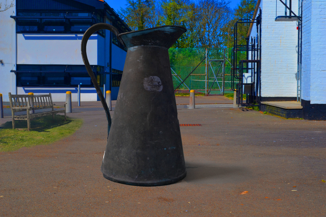
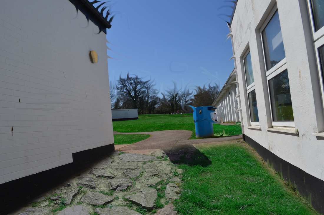
I then again used the hue/saturation to try to make the grass look as in place as possible by matching the colours. I put this layer here because it matches the shadow and leading lines are made with the building in the background since it has so much detail then the walls have formed leading lines down towards the bench and the centre. Also I made the grass so bright green because it creates a strong contrast from its grey surroundings, drawing the audience’s attention.
I changed the eraser tool to the faded one, took down the opacity to 70% and quickly went around the grass layer to neaten it up with the edges. The stair rails show leading lines towards the centre of the image where all the key detail is located. The bright green grass also show a strong contrast between the walls and the grass itself.
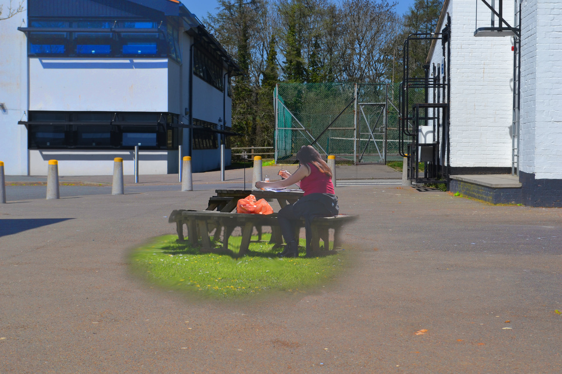
For this photo I decided to add a woman sitting in the sunshine on a bench on the grass, cropped out the image using quick selection tool and dragged it onto the second layer used magic wand tool to select all the out of place patches for example between the bench legs there was concrete slabs and bits were showing the sky from the image it was cut out of. I then used the faded eraser tool on 90% to fade the edges into the ground, then to finish the layer of I used smudge tool to smudge the layer into the ground to make it look natural within the environment. This picture shows a strong contrast between the first layer and the second layer, by the grass being incredibly green compared to the grey concrete it makes the two stand out from each other dramatically and allows the audience to straight away identify the key detail I wanted them to discover.
I used a range of different image to create this fantastic and strange final piece, the use of contrast and rule of thirds carefully selects bits of detail to draw the audience in to the image and to the detail. I then made the image black and white also in order to relate to Jerry Uelsman where he does this in order to create a stronger contrast within the image and get his idea and theam across better.
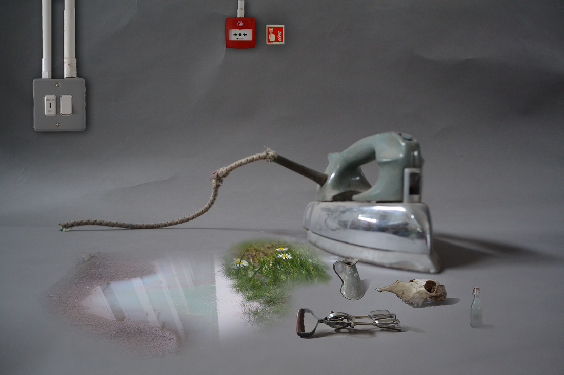
In this photo i used rule of thirds in order display all my detail and to scale out all my layers in order to get my fantastic and strange theam across to the audience.
In this photo i used editing in order to create a strong use of rule of thirds and contrast, i used these techniques so the idea of fantastic and strange was very easy to spot as the theam. This photo relates to Jerry Uelsmans becasue of his fantastic and strange work heavily inspired these final pieces, from where i would add different layers ontop of each other to make the image look non-ordinary but still to scale.
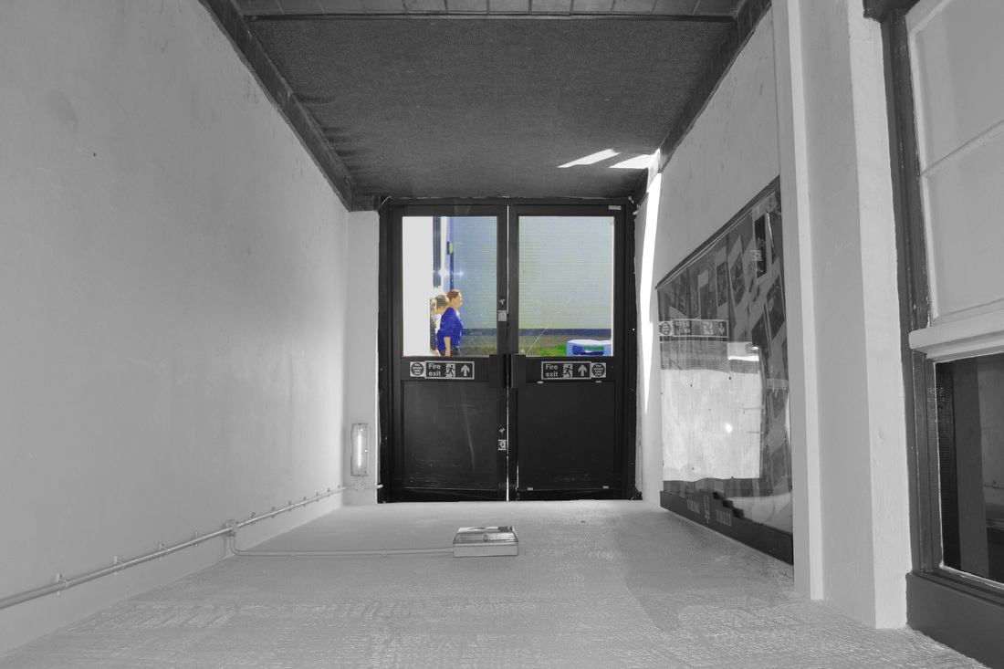
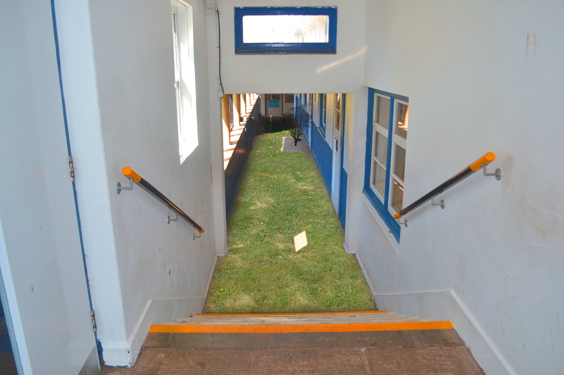
This was a very simple idea but still played the eye and looked fantastic /strange. One of the main techniques i used within this final piece was contrast, contrast allowed me to make my key points stand out from the background, for example i made everything around the door glass frames black and white to make the outside stand out to get across more clearly that the corridor is upside down.
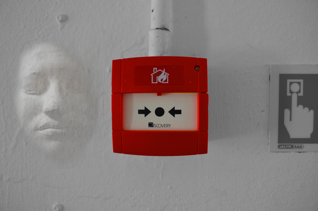
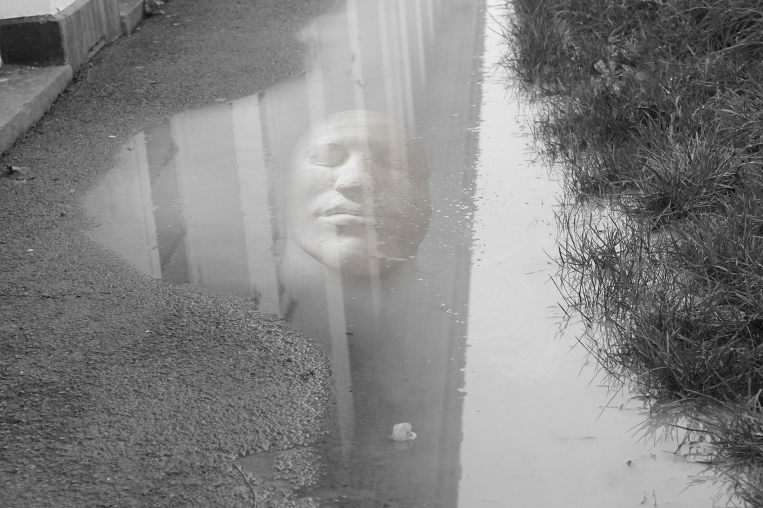
In this image i used contrast to separate the different bits of detail, i used contrast through making the background black and white and the red fire alarm bright red through increasing the saturation of the red. I did this clearly show the connotations of strange and fantastic.
